Recently WebTrends blogged that Twitter search will now be listed in the standard search engine and keywords report in WebTrends. Omniture has also blogged about integrating Twitter search data into Site Catalyst.
As Twitter increasingly becomes a tool that people use to find information it is really critical for companies to know how people are finding their sites on Twitter. Doing so will allow them to incorporate that learning into future marketing efforts on Twitter as well as other sources (e.g. Google etc).
Since Google Analytics does not yet recognize Twitter search as a search engine like WebTrends or Ominiture does, I will show you how you can do it easily with one line of code.
However, keep in mind this solution only works when the search originates on Twitter (i.e. http://search.twitter.com). 3rd party tools like TweetDeck, those will not be captured in this solution (nor will it, I believe, be captured in WebTrends’ solution). Use this information to understand general search keywords being searched on Twitter but do not get caught up in actual number of visits that your Twitter efforts are driving.
So how do you capture searches conducted in Twitter?
GA provides a few functions to allow you to add your own search engines to the list of search engines that are already tracked by GA.
_addOrganic(newOrganicEngine, newOrganicKeyword)
You simply call this function right after var pageTracker = _gat._getTracker("UA-XXXXXX-X"); This functions to track any custom search engine.
Twitter uses "q" as the querystring that contains the keyword. So in this case our search engine is search.twitter.com and newOrganicKeyword is the value in query string q
So you code will look like
var pageTracker = _gat._getTracker("UA-XXXXXX-X");
pageTracker._addOrganic("search.twitter.com", "q")
pageTracker._trackPageview();
(Note: pageTracker._addOrganic("twitter", "q") will also work)
What will the reports look like in Google Analytics?
Note: For some reason I cannot get Twitter search to show up as Twitter in Google Analytics Search Engines report, it shows up as "search"(Maybe it’s a bug in GA? If anybody can provide pointer that will be a great help). However, for now this works fine as long as you know what "search" means in your search engine report. I am playing with filters and if I get that resolved I will post the fix or if you know the fix please email me.
Search Engines Report will show the following:
Drilling down to keywords will show the keywords on Twitter Search.
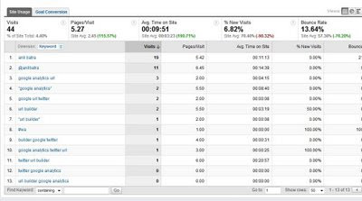
Looks like Twitter Search brings me repeat visits and more engaged traffic.
Comments? Questions?
My other posts on Twitter:
----------------------------------------------------------------------------
Looking to fill your Web Analytics or Online Marketing position?Post your open jobs on http://www.web-analytics-jobs.com/
Sr/Lead Analytic Warehouse/Java Engineer at Saas Company In the SF Bay Area (Emeryville, CA)
----------------------------------------------------------------------------
Site: AnilBatra.com
Twitter: http://www.twitter.com/anilbatra
Wednesday, 25 February 2009
Tuesday, 24 February 2009
Google Analytics Motion Charts Overview with a PPC Example
Most people look at click through rates, clicks or visits when analyzing their keywords. Some people will go a step further and look at the conversion rates. If you have a content site with no end conversion you might look at bounce rate to figure out what keywords are working or you might look at the page views/visit or look at some other form of engagement metrics. To look at all the data points you need to do full analysis, which requires you to look at a few reports and maybe use excel to pull all that data together in one view. Google Analytics Motion Charts make it really easy to visualize several data points in one screen.
In this post I will show:
Let’s get started
To access motion charts,
In the motion charts interface you can choose up to four dimensions that you can plot your data point against and see it in this graph. The four dimension areas are circled in the image below. Two dimensions can be plotted on the chart on X-axis and Y-axis, one using the color and the fourth using the size of the bubble that represents the data point.
For the dimensions on X-Axis and Y-Axis you have the option to plot the data either on “Linear” or “Log” scale. I chose linear in this case. (Note: You should choose log when your data points have too much variations in their values from one day to another. Using a linear scale will make it hard to draw them on one chart but log scale will make the chart much cleaner.)
You can select the dimensions by clicking on appropriate section (see below)
After you have selected your dimensions and chosen the scale (log or linear) you want, click on the data points (bubbles in the middle of the chart) to show the name of the data point. Also, those data points are will be tracked when the “Trails” option is enabled (discussed below).
Once all your selections are done you can check the “Trails” check box to track the progression of each data point on each of the dimensions you selected over the time period that you selected. Even though “Trails” is optional, I have found it to be an important feature to explore the full power of motion charts.
Note: if you select too many bubbles (keywords in this case) along with “Trails” then the motion charts become very crowded. You should limit selection to no more than 3 bubbles at a time.
In this case I chose two keywords, Keyword A and Keyword B since I wanted to see how they compare to each other on the dimensions that I chose. (Actual keywords are disguised for this example).
So why did I choose those two keywords? I actually chose a lot of keyword combinations. I was trying to find the keywords which I should buy on search engines to drive more traffic. Since the budget is limited (isn’t that the case everywhere?) I had to pick the keywords that will give us the biggest bang for our buck.
This site had two main site goals:
Based on these goals we needed to see following metrics:
Since both the keywords had about same conversion rate, it was not important for us to plot it on X and Y-axis and it was chosen to be represented by the bubble size. I plotted metrics 1 and 2 (see above) on Y-axis and X-axis respectively since I wanted to see how the traffic is driven and how many pages people view when they visit the site. Bounce Rate was chosen to show different colors.
In my option, any critical metrics should go on X-axis and Y-axis. You should play with plotting all different metrics on different axis, color and size to see which one provide you more meaningful view. Plotting them in different ways provide different views and ideas of additional metrics that you might want to look at.
After all the dimension selections were made, I checked the “Trails” option and hit the “Play” button to see the motion chart in action (You can also manually move the slider next to play button).
Here is the final Motion Chart:
Looking at this it is clear that Keyword A is driving more traffic but lower Pages/Visit than Keyword B. The bounce rate is also higher for keyword A. The conversion rate is about the same for both keywords.
It is clear that we should put more dollars behind Keyword B as it helps us achieve goal number 2 better than Keyword A. Goal 1 is about the same for both these keywords.
Hope this post was helpful in demystifying Google Analytics Motion Charts.
For any questions on Motion Charts and Google Analytics please visit Ask an Expert section on my site.
Comments? Questions?
----------------------------------------------------------------------------
Looking to fill your Web Analytics or Online Marketing position?Post your open jobs on http://www.web-analytics-jobs.com/
Sr/Lead Analytic Warehouse/Java Engineer at Saas Company In the SF Bay Area (Emeryville, CA)
----------------------------------------------------------------------------
Site: AnilBatra.com
Twitter: http://www.twitter.com/anilbatra
In this post I will show:
- Step-by-step overview of how motion charts work.
- An example of how I used Google Analytics motion charts to figure out which keyword to spend money on.
Note (I could have got similar information from a few reports in Google Analytics, but motions charts just made it easier and faster).
Let’s get started
To access motion charts,
- Click on your report (keywords report in this case).
- Select the date range that you want to analyze.
- Click on Visualize button on the top. This will bring the motion chart (see below).
In the motion charts interface you can choose up to four dimensions that you can plot your data point against and see it in this graph. The four dimension areas are circled in the image below. Two dimensions can be plotted on the chart on X-axis and Y-axis, one using the color and the fourth using the size of the bubble that represents the data point.
For the dimensions on X-Axis and Y-Axis you have the option to plot the data either on “Linear” or “Log” scale. I chose linear in this case. (Note: You should choose log when your data points have too much variations in their values from one day to another. Using a linear scale will make it hard to draw them on one chart but log scale will make the chart much cleaner.)
You can select the dimensions by clicking on appropriate section (see below)
After you have selected your dimensions and chosen the scale (log or linear) you want, click on the data points (bubbles in the middle of the chart) to show the name of the data point. Also, those data points are will be tracked when the “Trails” option is enabled (discussed below).
Once all your selections are done you can check the “Trails” check box to track the progression of each data point on each of the dimensions you selected over the time period that you selected. Even though “Trails” is optional, I have found it to be an important feature to explore the full power of motion charts.
Note: if you select too many bubbles (keywords in this case) along with “Trails” then the motion charts become very crowded. You should limit selection to no more than 3 bubbles at a time.
In this case I chose two keywords, Keyword A and Keyword B since I wanted to see how they compare to each other on the dimensions that I chose. (Actual keywords are disguised for this example).
So why did I choose those two keywords? I actually chose a lot of keyword combinations. I was trying to find the keywords which I should buy on search engines to drive more traffic. Since the budget is limited (isn’t that the case everywhere?) I had to pick the keywords that will give us the biggest bang for our buck.
This site had two main site goals:
- Convert visitors to registered members (Registration).
- Drive more page views/visit to increase the ad inventory and hence ad revenue.
Based on these goals we needed to see following metrics:
- Conversions driven by keywords
- Visits Driven by Keywords
- Page views/Visit
- Bounce Rate
Since both the keywords had about same conversion rate, it was not important for us to plot it on X and Y-axis and it was chosen to be represented by the bubble size. I plotted metrics 1 and 2 (see above) on Y-axis and X-axis respectively since I wanted to see how the traffic is driven and how many pages people view when they visit the site. Bounce Rate was chosen to show different colors.
In my option, any critical metrics should go on X-axis and Y-axis. You should play with plotting all different metrics on different axis, color and size to see which one provide you more meaningful view. Plotting them in different ways provide different views and ideas of additional metrics that you might want to look at.
After all the dimension selections were made, I checked the “Trails” option and hit the “Play” button to see the motion chart in action (You can also manually move the slider next to play button).
Here is the final Motion Chart:
Looking at this it is clear that Keyword A is driving more traffic but lower Pages/Visit than Keyword B. The bounce rate is also higher for keyword A. The conversion rate is about the same for both keywords.
It is clear that we should put more dollars behind Keyword B as it helps us achieve goal number 2 better than Keyword A. Goal 1 is about the same for both these keywords.
Hope this post was helpful in demystifying Google Analytics Motion Charts.
For any questions on Motion Charts and Google Analytics please visit Ask an Expert section on my site.
Comments? Questions?
----------------------------------------------------------------------------
Looking to fill your Web Analytics or Online Marketing position?Post your open jobs on http://www.web-analytics-jobs.com/
Sr/Lead Analytic Warehouse/Java Engineer at Saas Company In the SF Bay Area (Emeryville, CA)
----------------------------------------------------------------------------
Site: AnilBatra.com
Twitter: http://www.twitter.com/anilbatra
Wednesday, 18 February 2009
Things I have been working on
There has been a lag in my blog posting lately, and it’s gone on longer than I like. Lately, things have been hectic at work leaving very little time for blogging. Any time left has been consumed the following activities:
I expect to resume my blog writing schedule very soon.
----------------------------------------------------------------------------
Looking to fill your Web Analytics or Online Marketing position?
Post your open jobs on http://www.web-analytics-jobs.com/
Sr/Lead Analytic Warehouse/Java Engineer at Saas Company In the SF Bay Area (Emeryville, CA)
- Working on my Site, AnilBatra.com
- Ask an expert – I started a section for you to ask questions on Web Analytics, Behavioral Targeting and Web Analytics tools, particularly Omniture, WebTrends and Google Analytics. The questions will be answered by one of the people who have volunteered, one of my team members at Ascentium or me personally. So if you have a question please go ahead and fill out the form and someone will get back to you within 48 hours. If you would like to be one of the experts please email me a brief description about your skills and experience.
- Twitter – Google Analytics URL Builder – Nothing fancy here but a tool that allows you to create short URLs that you can post in Twitter and track them in your Google Analytics. It allows you to create short URLs for both your internal links (links to you own site) and external links (links that reside outside your site).
- Calculators – I am working on some basic and advanced calculators related to Web Analytics and Online Marketing. So far I have added a CPM, CPC, and CPA calculator (will be adding few more optional fields to it). More calculators will be added to this one. If you have suggestions on what calculators I should add then please send them to me.
- Industry Average Bounce Rates – I conducted a survey to understand what Bounce Rates to expect for various types of sites. I added a pdf that shows the results of this survey.
- Google Analytics Session for Seattle Tech Startup Group - I, along with Loren Bast, conducted a Google Analytics training session for the Tech Startup community of Seattle. Download the Seattle Tech Startup Google Analytics Presentation.
- Future of Web Analytics Panel at SDMA – I have been busy putting together a panel for the Seattle Direct Marketing Association to be held on March 11.
- Preparing for Breakfast Event in San Francisco – Gary Angel, Akin Arikan and I will be speaking at a breakfast event in San Francisco on March 9th. You can find more information and registration on my site.
- Neel – Neel is the name of my 5.5 month old son. He is growing and getting more and more active every day and needs more of my time.
I expect to resume my blog writing schedule very soon.
----------------------------------------------------------------------------
Looking to fill your Web Analytics or Online Marketing position?
Post your open jobs on http://www.web-analytics-jobs.com/
Sr/Lead Analytic Warehouse/Java Engineer at Saas Company In the SF Bay Area (Emeryville, CA)
----------------------------------------------------------------------------
Site: AnilBatra.com
Twitter: http://www.twitter.com/anilbatra
Site: AnilBatra.com
Twitter: http://www.twitter.com/anilbatra
Monday, 9 February 2009
Social Network in Action: How Twitter Helped Me
Twitter has become a tool that I have come to love. It has provided me a way to connect with people I have never met, and it has helped me find information that I might have missed otherwise. A recent experience on Twitter showed me how this tool can be used to gather customer feedback and also to collaborate with others to solve a problem.
Last week I wrote a small tool to help me create short url’s with Google Analytics Tracking embedded in them. This tool allows me to create short URLs for links that are both external (not residing on my site) as well as internal (residing on my site). The tool is open to the public so please give it and try and send me your feedback. It is nothing fancy but something that I needed for my own use. (More on this in another blog post). (Also see, Twitter Analytics and Google Analytics Twitter URL Builder)
At 11:04 p.m. on February 5th I tweeted about this tool.
Within minutes I got my first feedback in a direct message (also called “DM” in twitter language).
Yes, I had not tested the tool in other browsers and O/S but my Twitter friends came to my rescue and provided me valuable information. Several other people jumped in and provided feedback. I immediately jumped into action to fix this issue. Had it not been for Twitter I don’t think I would have been able to get such feedback so quickly.
Next I was able to isolate the issue, which was a JavaScript problem. The JavaScript I had on the page worked fine on IE but not on Firefox. Since I am rusty with my JavaScript I had 4 options
Given that it was late, I went to bed and thought about fixing the JavaScript issue the next morning. The next morning I decided to give option number 4 a try, and posted the following message in Twitter:
I posted the message on Twitter at 7:25 a.m. and within minutes I got reply from my Twitter friends, who helped to debug or find a solution for me.
Isn’t Twitter a powerful tool for feedback and collaboration? Despite all the noise that happens on Twitter, it can be a very valuable tool, as I have found it on several occasions.
Following are my Twitter Friends, who provided me the valuable feedback, helped with the javascript issue and/or help spread the word via their ReTweets (Thank you all).
Last week I wrote a small tool to help me create short url’s with Google Analytics Tracking embedded in them. This tool allows me to create short URLs for links that are both external (not residing on my site) as well as internal (residing on my site). The tool is open to the public so please give it and try and send me your feedback. It is nothing fancy but something that I needed for my own use. (More on this in another blog post). (Also see, Twitter Analytics and Google Analytics Twitter URL Builder)
At 11:04 p.m. on February 5th I tweeted about this tool.
Within minutes I got my first feedback in a direct message (also called “DM” in twitter language).
Yes, I had not tested the tool in other browsers and O/S but my Twitter friends came to my rescue and provided me valuable information. Several other people jumped in and provided feedback. I immediately jumped into action to fix this issue. Had it not been for Twitter I don’t think I would have been able to get such feedback so quickly.
Next I was able to isolate the issue, which was a JavaScript problem. The JavaScript I had on the page worked fine on IE but not on Firefox. Since I am rusty with my JavaScript I had 4 options
- Search on a search engine and try to sort out all the content and find what I was looking for.
- Call one of friends/colleagues/Freelancers who are JavaScript gurus
- Buy a JavaScript book and try it on my own
- Try to find if my Twitter friends (people I might not have met in person but are following me on twitter) will help again
Given that it was late, I went to bed and thought about fixing the JavaScript issue the next morning. The next morning I decided to give option number 4 a try, and posted the following message in Twitter:
I posted the message on Twitter at 7:25 a.m. and within minutes I got reply from my Twitter friends, who helped to debug or find a solution for me.
Isn’t Twitter a powerful tool for feedback and collaboration? Despite all the noise that happens on Twitter, it can be a very valuable tool, as I have found it on several occasions.
Following are my Twitter Friends, who provided me the valuable feedback, helped with the javascript issue and/or help spread the word via their ReTweets (Thank you all).
- Bryan T Robertson
- Deepak Kumar
- Stephane Hamel
- Birger Friedrichs
- Marcelo Calbucci
- David Iwanow
- Jeremy Sisson
- Krishna
- DorisEichmeier
- cbgreenwood
- moniforce
- Thomas Bosilevac
- Shannon Yelland
- Aaron Lovelace
- Neil Minetto
- Stuart Schwartz (He has helped me a lot with the JavaScript used on that tool)
Comments? Questions?
----------------------------------------------------------------------------
Looking to fill your Web Analytics or Online Marketing position?
Post your open jobs on http://www.web-analytics-jobs.com/
----------------------------------------------------------------------------
Site: AnilBatra.com
Twitter: http://www.twitter.com/anilbatra
Subscribe to:
Posts (Atom)